Well hello you lovely lot! Golly gosh it’s been a while. Let’s just say life has been busy in the best of ways… actually, let’s save client work, creative collaborations and life updates for a whole other conversation. Oooh what a tease!
Colour - It’s like science… but more fun and less complicated
Colour. A beauty that is truly in the eye of the beholder. What fascinates me is how we all view colour so differently. Some of us drawn to minimalism. Some as vibrant as they come. Yet, at the heart of it all, colour speaks to us on so many levels. It can be used to evoke an emotion, to bring something to life or make an impact.
I believe that colour in itself is an art form. Get your colour palette right and everything else has a better chance of falling into place.
There was a time that I didn’t actually know how to use colour. We all start somewhere. I have always been drawn to colour, specifically how they sit next to each other. Once I started to view colour like a science, that’s when I began to use it to it’s full potential.
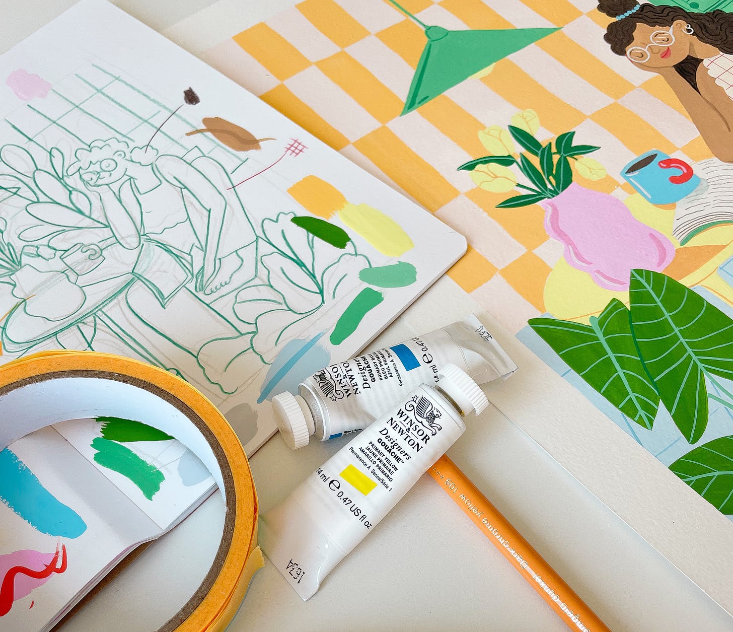
You have to experiment, trial and record the process. Analysing the variables such as quantity, composition and placement will give you a better understanding of what works and what doesn’t. Mix some elements and you have an explosion, a discovery, mix others and nothing happens.
Soooo imma give you a few of methods I’ve found helpful:
Get “sourceful”
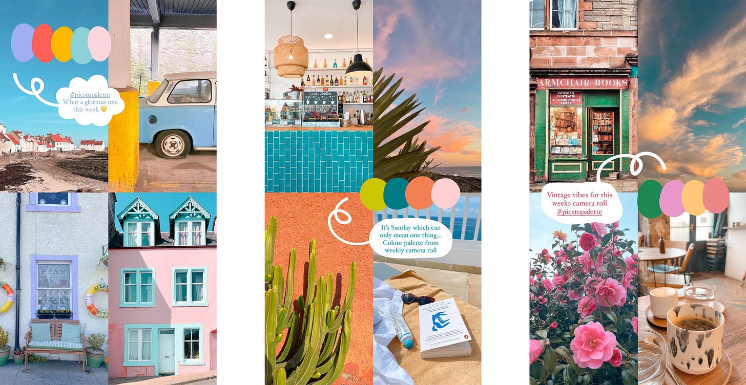
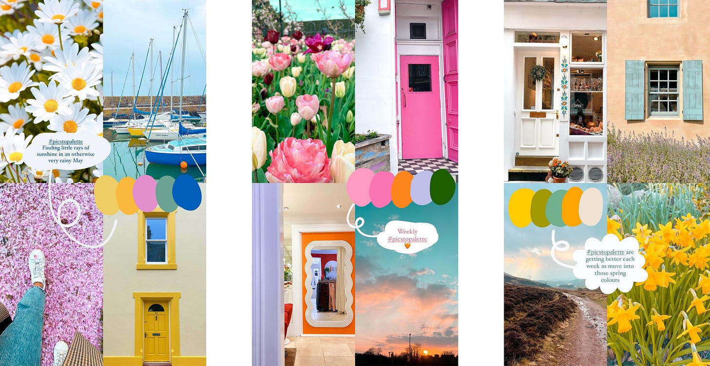
Where we source inspiration from is such a key component to building a good eye for colour. Resources and guidance are great but using your own references is even better because they are specific and unique to you. I began a little activity on my social media called #PicsToPalette as a way to inspire me to venture out of my regular palettes but also give me an understanding of what works and why. Taking pictures throughout the week of my surroundings has been an excellent way to produce inspired palettes. By picking the most prominent or featuring colours it’s forced me to reduce the quantity and intensity to create limited and inviting palettes.
Word association
Choosing a word is a great starting point to help you pick colours that work with your work. People often use the word uplifting to describe my style. This is music to my ears! It’s taken me a long time to find this. If you find colour picking tricky, pick a word, close your eyes, now see what colours you associate with that word.
The Three C’s
Context. Cohesion. Composition. Like anything we do, breaking it down into manageable chunks is an easier way to build the bigger picture.
Whether it’s self initiated or client led projects, my trusty little Three C’s is an approach I implement to ensure the final image will come together.
Context : Without context nothing makes much sense. It’s the same with colour. What is the meaning behind the piece, what feeling are you trying to provoke, what is the purpose of said creation? These are all important questions to ask yourself before picking your palette.
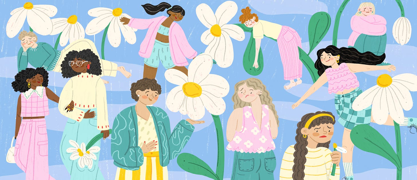
My original palette for this piece didn’t meet the clients requirements as the whole project was about the menstrual cycle. I’m not a fan of red… but in this case context is key and completely changed the overall feel of the final piece.
Cohesion : To those who are fortunate enough to be able to work in two colours and be happy as Larry, complementary colours are your bestie. For those like myself that consider 10 or so colours a “limited palette” then cohesion is so important. It’s not about mixing perfect individual colours but getting the right combinations that harmonise and balance with each other.
Composition : Colour composition isn’t something I hear about often - but it has the ability to make a visual either pop or plummet. Often, it’s not so much the colours we pick but the placement of them. Simply switching the colour you used in the foreground to the background can instantly change a piece without re-thinking your entire palette choice.
For my fellow colour enthusiasts
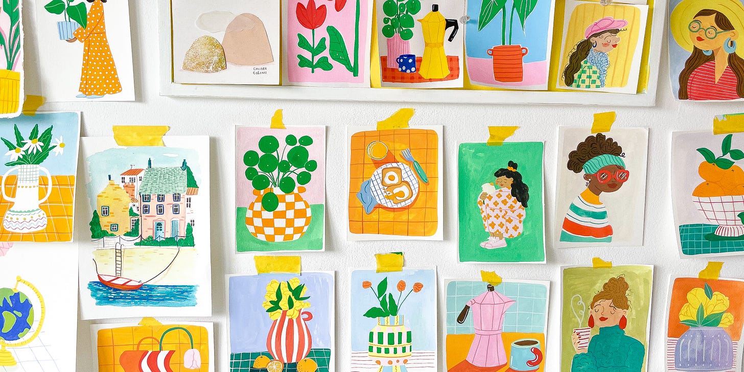
In all the midst of colour exploration I created many little paintings. Each one holds a special place in my squishy, colour driven heart as they have been inspired by an emotion or experience on the day of painting it. But, my wall is slowly overflowing and I’d love for them to go to new homes owned by wonderful, colourful souls like yourself…
One final colourful note…
This past week I’ve been so lucky to experience some of the most colourful moments in my life, but also some dull, subdued and bleak ones too. Just like a painting or visual piece, for brighter times to standout they often require some darker moments to make their appearance. I’ve noticed that allowing them to wash over and pass by only helps the other colours appear even more vibrant.
As always lovely souls, thank you for joining me here! Stay tuned because I’m feeling inspired to share more of my process and BTS again!


